Team:
UX/UI Designers, Developers, Project Manager, QA, Clients/Stakeholders
My Role:
UX/UI Designer
Designing a Scalable Query Experience for NCHS DQS
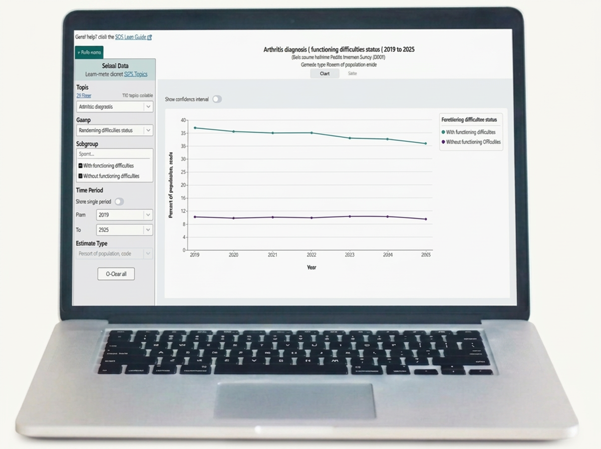
A redesign of the Data Query System interface and user experience to improve scalability, reduce visual complexity, and make better use of available space throughout the application.
Timeline: June 2024 - December 2024
Tools Used:
Adobe XD, DevOps
Areas Applied:
UX Design, UI Design, UX Research, UX Accessibility
Project Context
Application Background
The National Center for Health Statistics (NCHS) Data Query System (DQS) is a CDC health data application that allows users to explore estimates across a variety of topics and data sources. Because DQS brings together data from multiple sources, the application must accommodate different structures while maintaining a consistent and intuitive user experience.
As the product continues to evolve and incorporate additional data, its interface needs to be able to scale with that growth without becoming overly complex to navigate or understand. This makes the design of the application an essential part of the product, providing users with a clear and consistent way to interact with an increasingly diverse set of data.
Problem Area
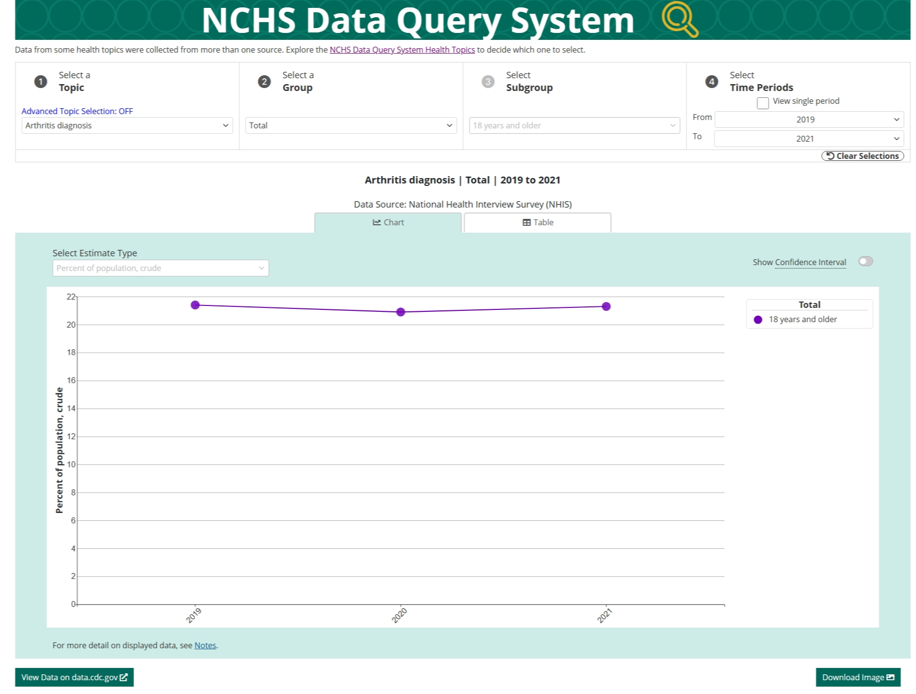
As we explored opportunities to expand the application, it became clear that the existing query area would need to support significantly more functionality. Planned and potential additions included moving the Estimate Type selector into the query area, adding resources such as the DQS User Guide, introducing additional filtering options such as taxonomy and classification, and merging or comparing visualizations.
However, the existing experience already presented several usability challenges:
Long dropdown labels made the interface difficult to scan. This was especially noticeable with subgroup names such as “Female: Native Hawaiian or Other Pacific Islander only, non-Hispanic.”
Adding more filters would further constrain the available space. Narrower dropdowns would cause labels to wrap onto multiple lines, making the query area increasingly difficult to navigate and understand at a glance.
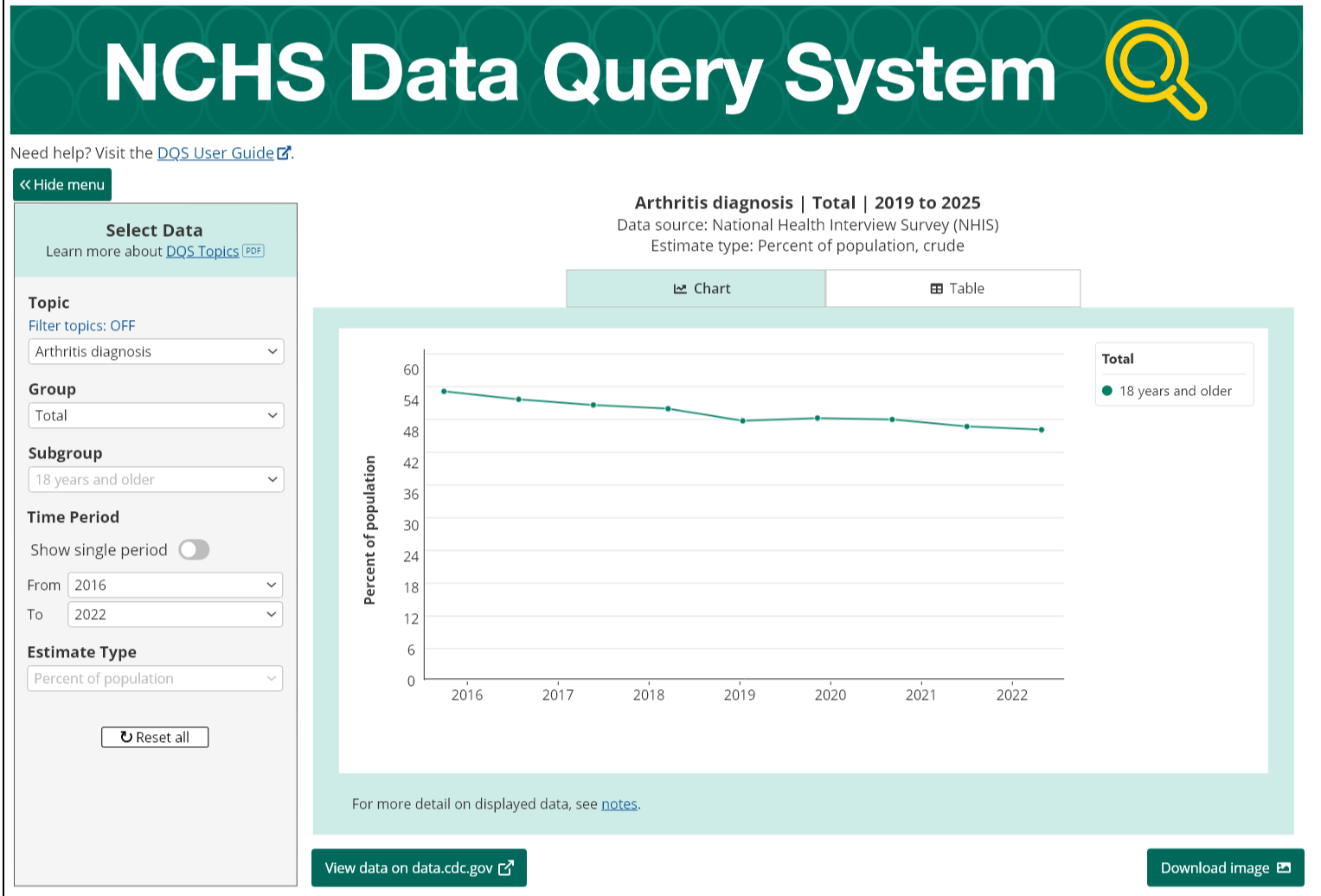
The visualization appeared below the fold, forcing users to scroll to see their results, creating unnecessary separation between making a query and viewing its outcome.
The responsive behavior was highly variable. The existing query selection shifted between four columns horizontally, then a 2-2-1 arrangement, and eventually four vertically stacked fields on mobile. While dynamic, this behavior resulted in inconsistent layouts and made the experience more difficult to predict across screen sizes.
Research
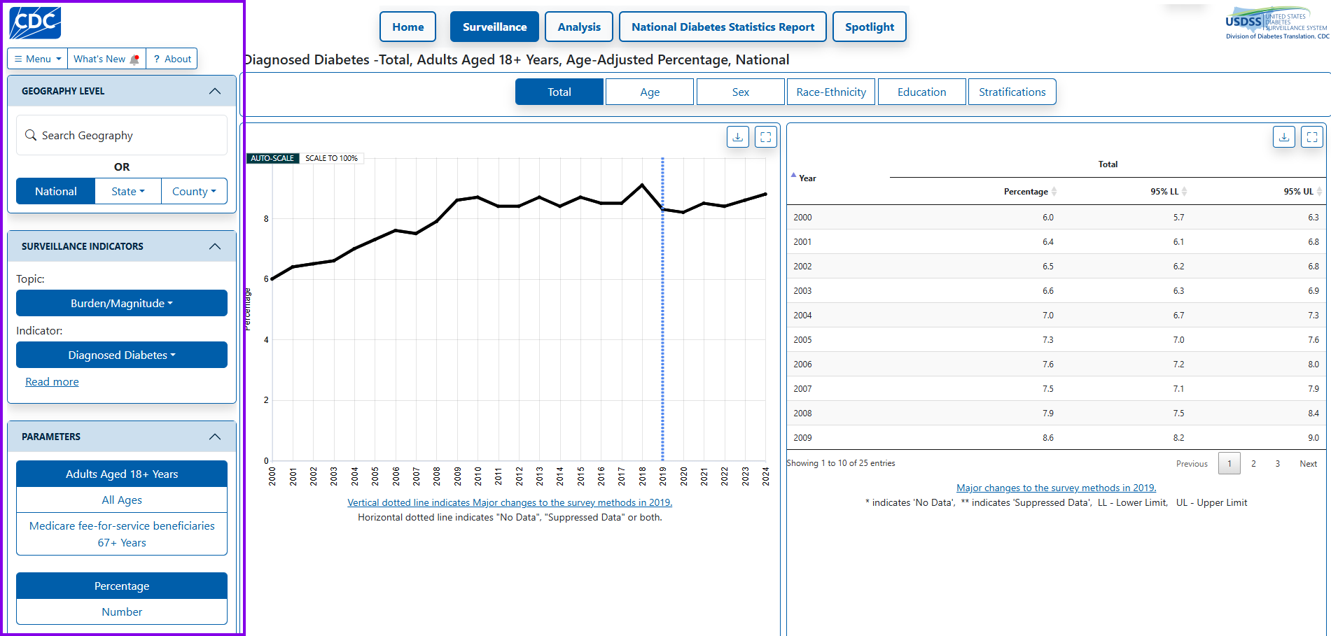
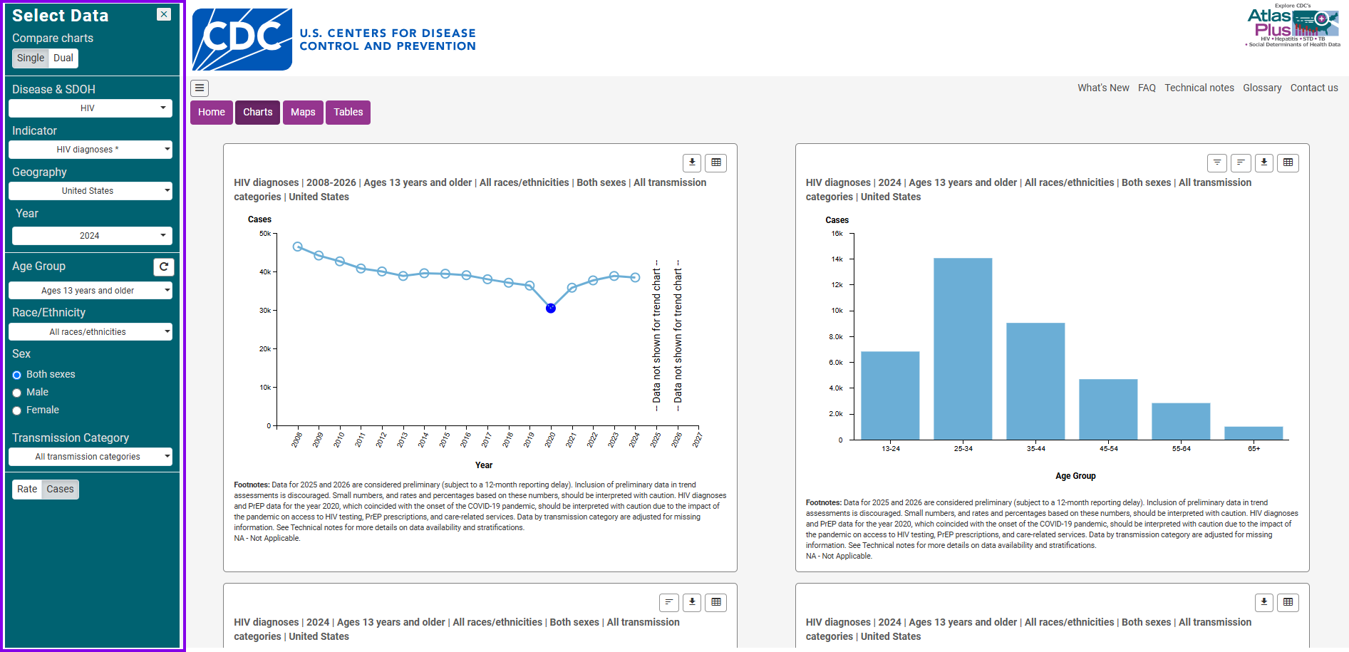
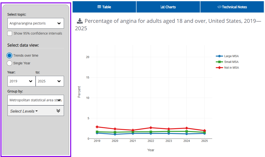
We compared multiple CDC health data applications with complex query processes to examine how they organize data selections. Across each application, we noticed a common theme of selections consistently arranged vertically to the left of visualization. This creates a clear linear flow that allows users to focus on one selection at a time while keeping the visualization in view.
Overall, the vertical approach addressed the key challenges identified in our existing application while also creating a more focused and organized way for users to navigate the query process. Based on these findings, we felt confident moving forward with this solution and began to develop wireframes.
To kick off the research phase, we began by reviewing any relevant UX laws and best practices to ensure users’ needs are accounted for and to establish a clear criteria when evaluating potential solutions.
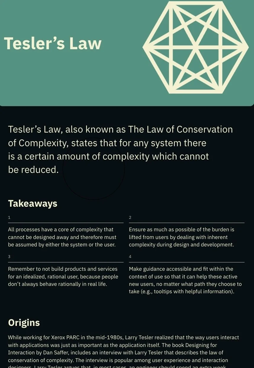
Tesler’s Law simply highlights the fact that there’s a certain amount of complexity that cannot be reduced. The query process requires users to work through multiple data selections and the expansion of the application would only introduce additional complexity. Our UX focus should remain on structuring the interface in a way that made the process as easy as possible to understand and navigate.
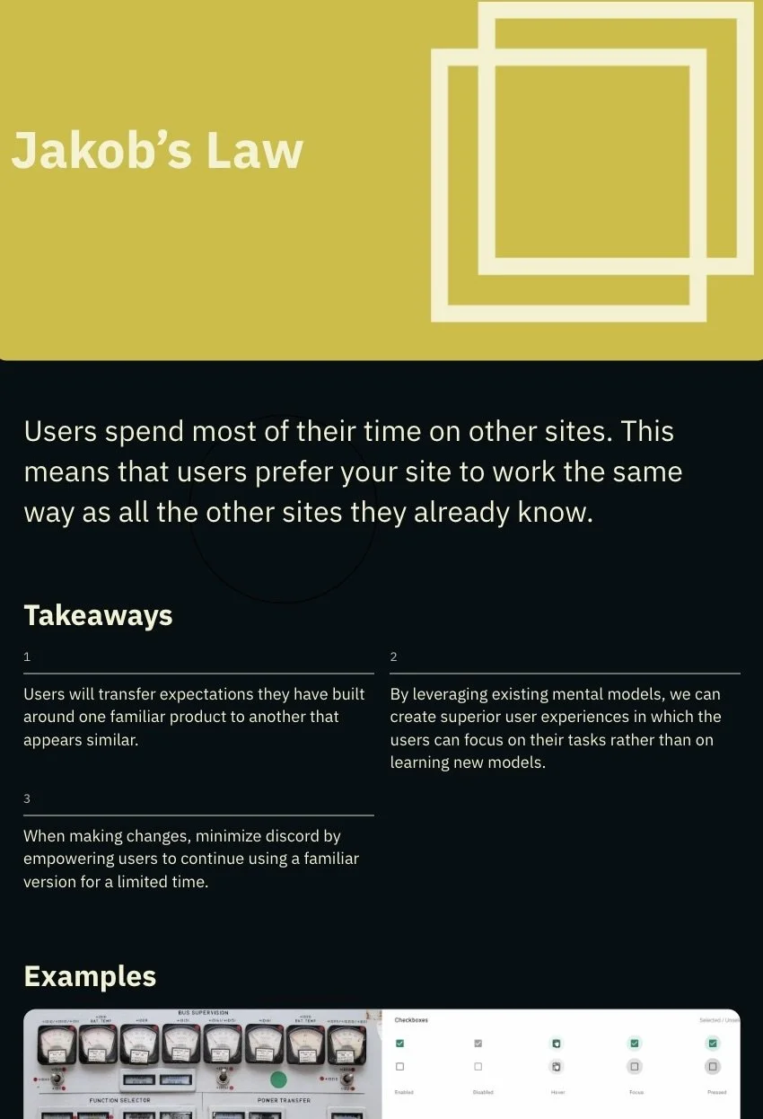
Jakob’s Law emphasizes the value of familiar interaction patterns. With DQS being one of many CDC health data applications, examining comparable query processes helps us identify common patterns and consider how those approaches could inform our own experience.
Competitive Analysis
Design & Prototype
Wireframe
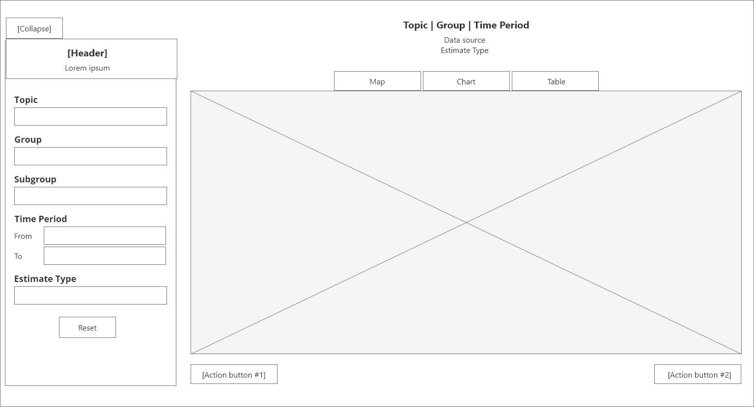
Providing a wireframe was essential for this design solution given the significant layout restructure. It gave the client an early, high-level view of the proposed direction, allowing us to validate the approach and make adjustments before developing detailed mockups.
High-Fidelity Mockup
Creating high-fidelity mockups next allowed us to build upon the approved wireframe structure while incorporating the visual details to showcase exactly how the proposed solution would look within the application.
Prototype
Developing the prototype demonstrated how the proposed solution would function within the application. Presented alongside the static mockup, it gave clients a complete view of both the solution’s visual design and functionality during the final presentation.
Handoff & Implementation
Developer Handoff
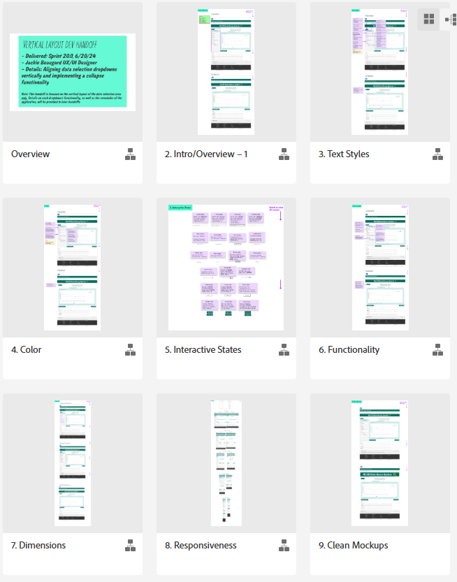
Once the designs were finalized and approved, we transitioned to the developer handoff to prepare for implementation. We provided the development team with the necessary design details and specifications, such as typography, color, functionality, responsiveness, and more, with Section 508 accessibility requirements incorporated throughout. Providing these details helped ensure the design intent and functionality were clearly communicated, allowing the solution to be implemented with accuracy and consistency.
Quality Assurance Testing
Following implementation, the UX team conducted QA testing in the internal test environment, reviewing the implemented solution against the developer handoff to identify visual, functional, and accessibility inconsistencies. We documented any discrepancies in DevOps ticket, allowing the development team to address issues before the solution moved into production. This testing was conducted alongside the official QA team to provide an additional layer of design-focused validation and ensure the implemented experience aligned with the approved solution.
Outcome
Overall, the DQS redesign established a more scalable and organized query experience that addressed the following key usability challenges within the existing application:
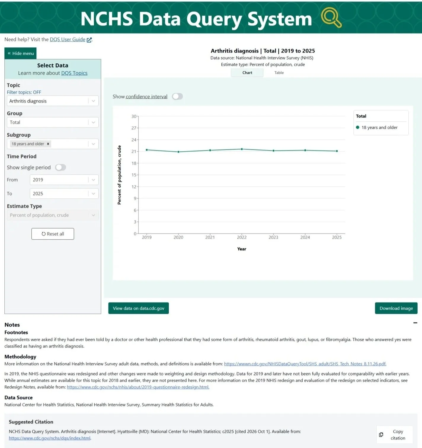
Scalable Query Structure: The updated vertical layout allowed the Estimate Type selector to be integrated with the other query controls, creating a more cohesive and scalable selection experience.
Responsive Experience: The new layout maintained a consistent experience across different screen sizes, allowing the query interface to adapt without compromising usability.
Real-Time Data Visualization: Users could see their data visualization update in real time as they made selections, eliminating the need to scroll to view changes to their results.
Reduced Cognitive Load: Users could collapse the selection menu when reviewing their results, allowing them to minimize distractions and focus more directly on the data being presented.
In addition, we also received internal feedback following the redesign indicating that the application felt significantly less legacy compare to the initial view, reinforcing the broader goal of modernization across the application.
Reflection / Lessons Learned
This project reinforced the importance of designing for scalability rather than focusing solely on the application's immediate needs. As DQS continued to expand, it became clear that adding more functionality without reconsidering the underlying structure would introduce additional complexity and make the query experience increasingly difficult to navigate.
One of my biggest takeaways was that effective UX design isn't always about removing complexity, but organizing it in a way that makes it easier to understand and manage. By restructuring the query interface into a more consistent vertical layout, we created a foundation that could accommodate additional functionality while maintaining a clear relationship between data selections and their visualized results.