Team:
UX/UI Designers, Developers, Project Manager, QA, Clients/Stakeholders
My Role:
UX/UI Designer
Designing for Metric Accuracy & Intentional Data Exploration
Implementing a proper app entry experience to improve the accuracy of engagement metrics by capturing intentional topic selections.
Timeline: April 2026 - August 2026
Tools Used:
Adobe XD, DevOps
Areas Applied:
UX Design, UI Design, UX Research
Project Context
Application Background
The National Center for Health Statistics (NCHS) Data Query System (DQS) is a CDC health data application that allows users to explore estimates across a variety of topics and data sources. After the application had been in use for several years, the data team began tracking metrics for each individual topic to gain knowledge on how users were engaging with the application.
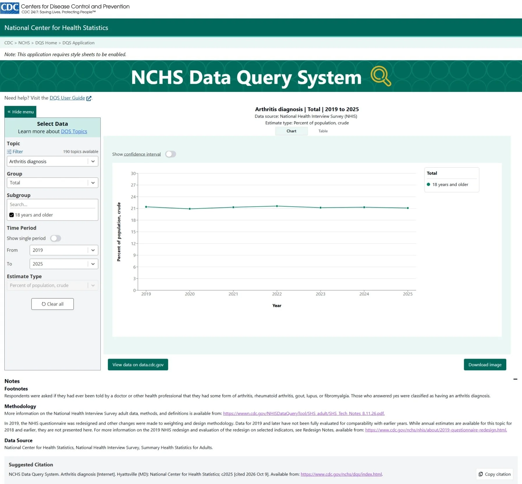
Once the data metrics dashboard were up and running, an interesting finding emerged. Arthritis diagnosis had significantly higher metrics than all of the others and the data team very quickly identified why. This was the first available topic in the application, receiving disproportionately high traffic.
Problem Area
When users entered DQS, the application automatically populated every query selection with the first available option in order to produce to visualization at all times. Query selections included:
Topic
Group
Subgroup
Time Period
Estimate Type
This meant that the first topic was being counted simply because it was the application’s default state, not necessarily because users just loved exploring Arthritis diagnosis data. The result was an inaccurate representation of topic engagement and required design input to establish a more intentional entry experience that would preserve the integrity of engagement metrics.
Design challenge
The solution needed to prevent the application from automatically assign a topic to a user’s session while still preserving an efficient experience for those who wanted to just explore.
Research
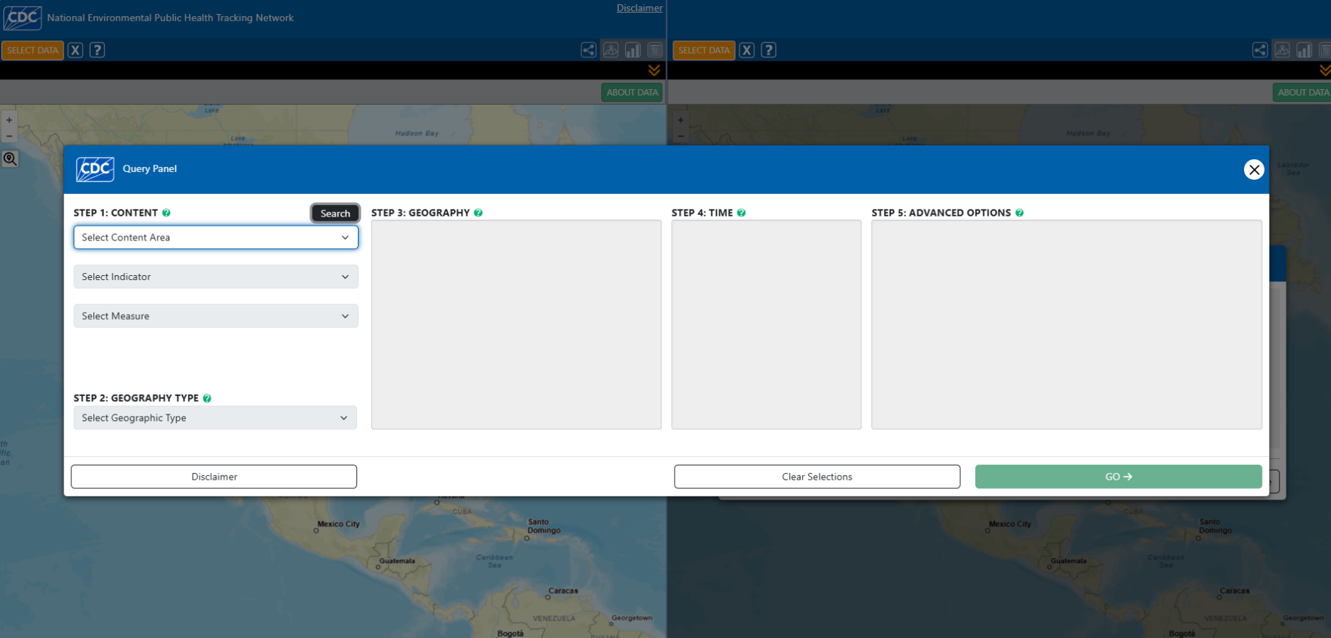
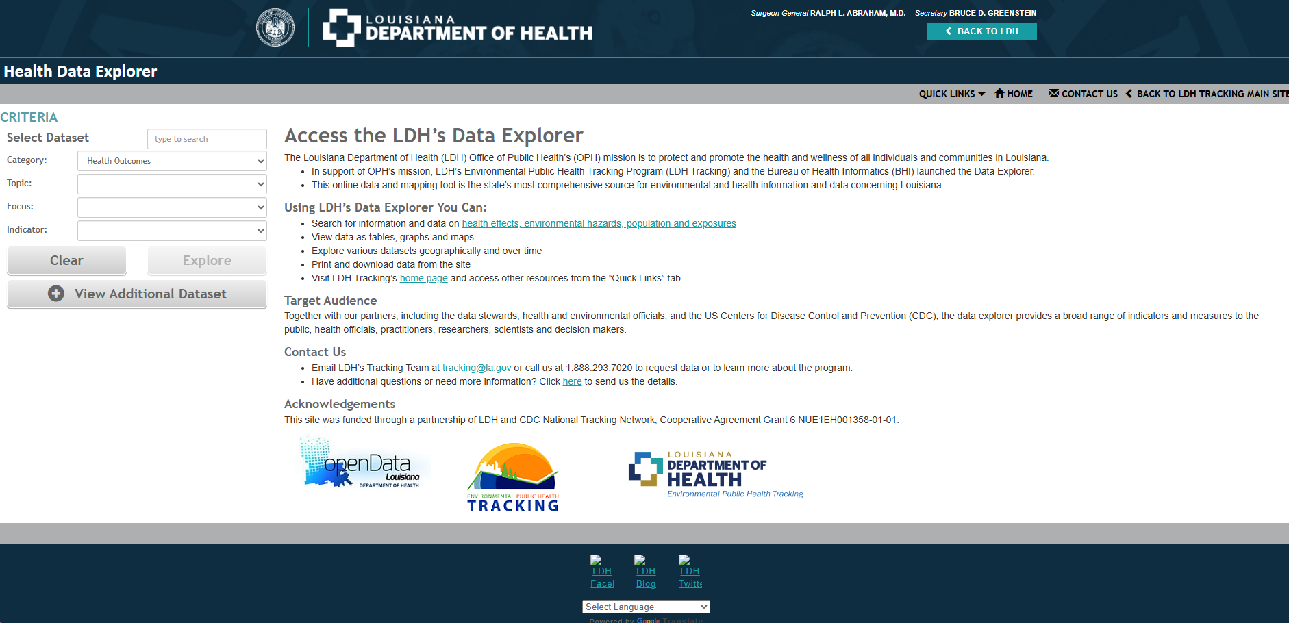
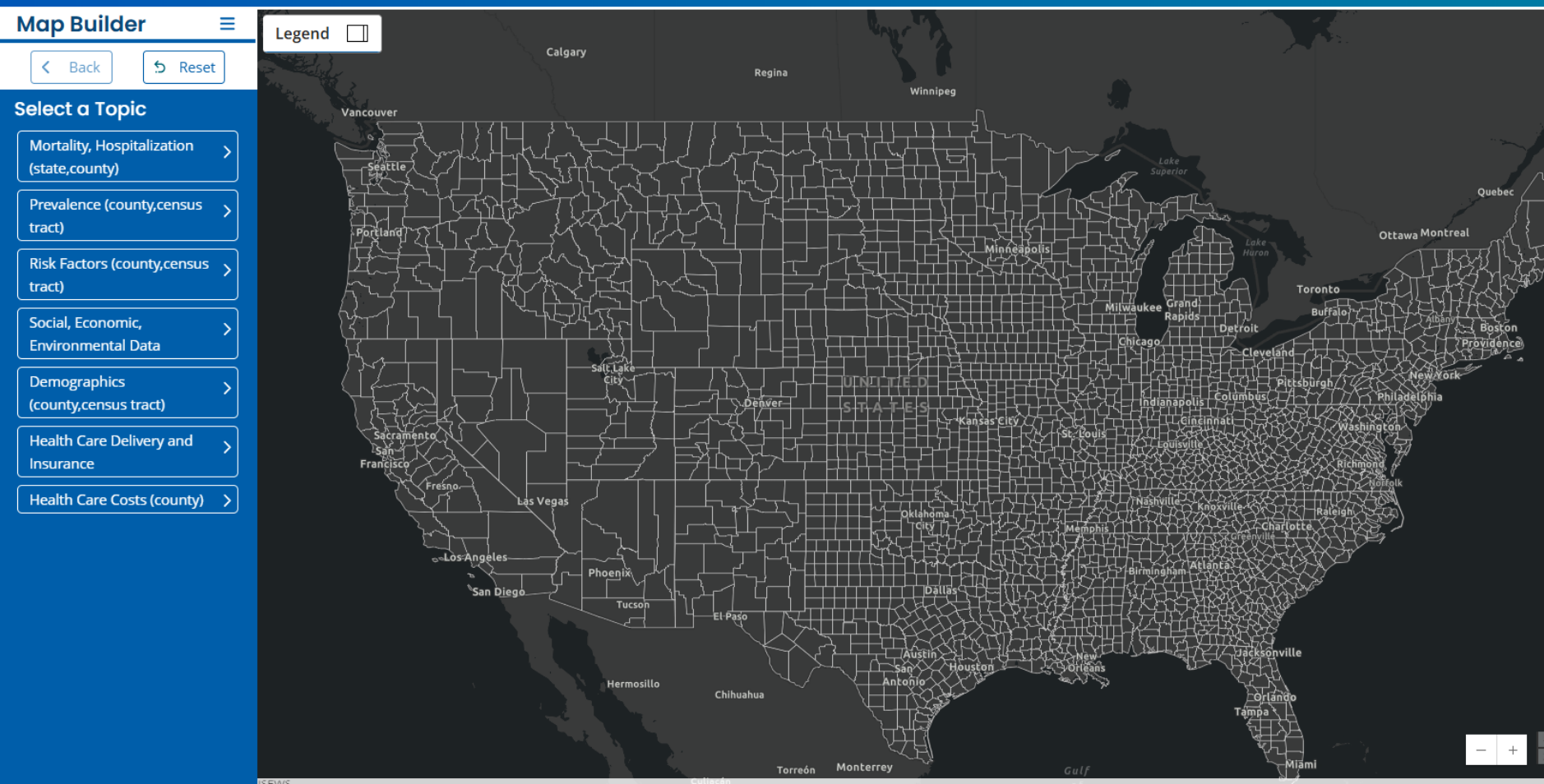
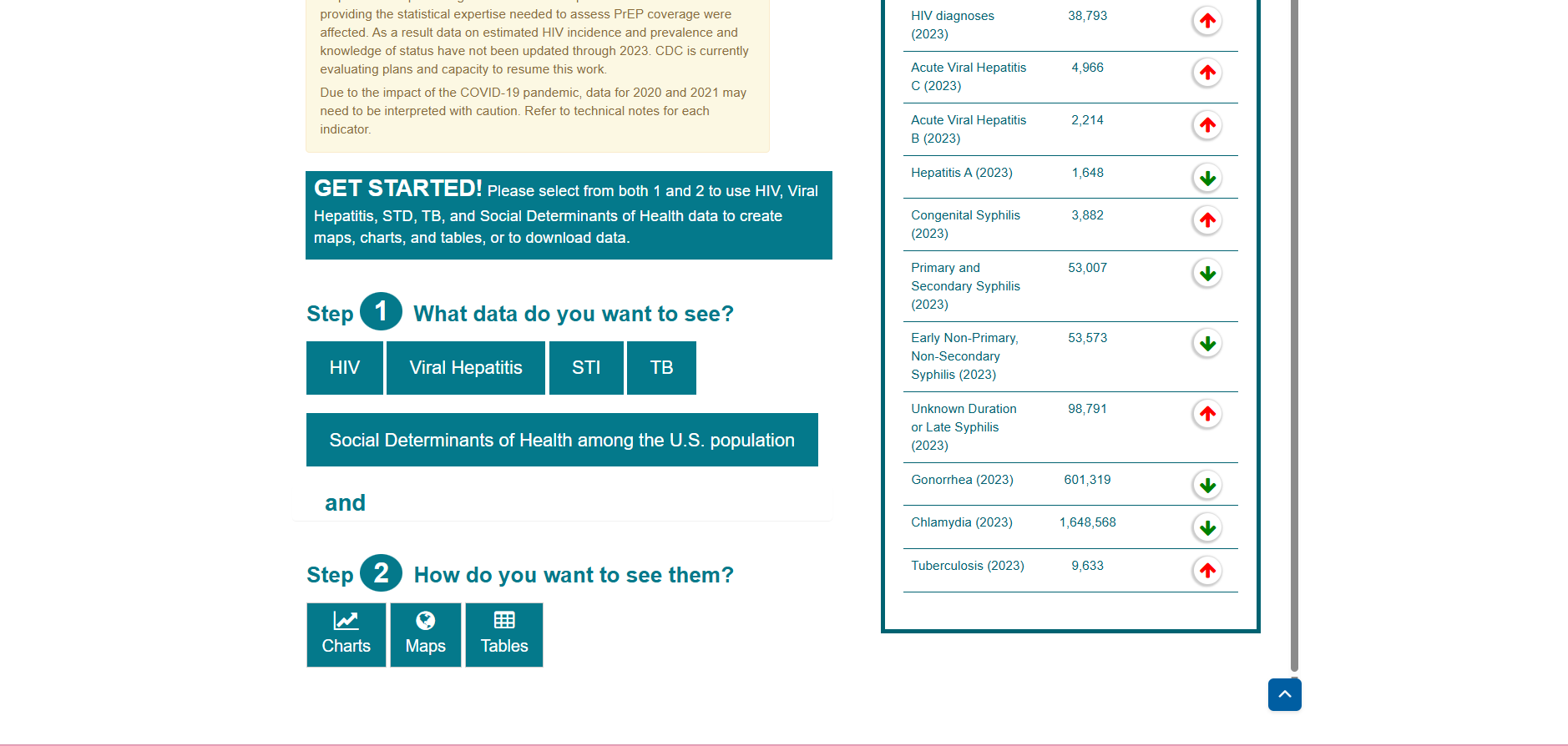
Before exploring solutions, I conducted a competitive analysis of several health data applications to understand how other products handled the initial state before a user had established a query. Applications included but not limited to:
CDC Atlas Plus
CDC NEPH
CDC Atlas of Heart Disease and Stroke
Louisiana Department of Health: Health Data Explorer
The analysis revealed that there was no single standard approach. Different applications used different entry patterns depending on their content and interaction model. Rather than identifying one universally preferred pattern, the analysis gave me several established approaches to evaluate against the needs of DQS.
Ideations
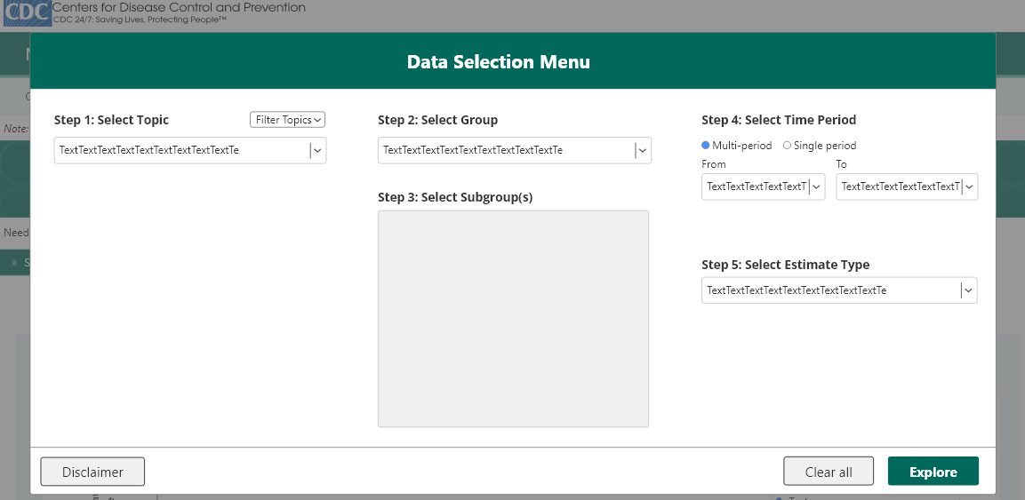
Following the competitive analysis, I narrowed down my ideations to two potential approaches for addressing the default selection issue. I created mockups to evaluate each concept based on the user flow, compatibility with the existing structure, and technical feasibility when consulting with developers.
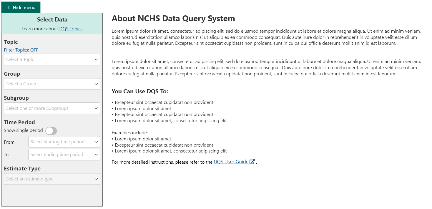
Ideation 1: Entry State
The existing application flow would remain intact, but the data visualization would be replaced with introductory verbiage and the query selections would begin empty. Data visualization would be populated one the user completed all query selections.
Advantage: Created a more intentional introduction to the application while keeping the remainder of the experience intact.
Concern: Developers indicated that implementing progressive filtering that is dependent on the prior selection would require this solution to be a separate entry page.
Ideation 2: Query Selection Modal
A large overlay would appear when users entered the application and guide them through their query selections before revealing the corresponding visualization.
Advantage: Provided a larger area for selection process compared to the existing left side menu
Concern: DQS already contained a filtering overlay within the query experience. Introducing another overlay would create a competing interaction pattern and potentially require the existing filter functionality to be incorporated into the new selection experience.
The overlay would also require users to reopen the modal whenever they wanted to modify their selections rather than allowing them to adjust their query while viewing the visualization.
Ultimately, I decided to eliminate the query selection modal solution due to its conflict with the existing filter interaction and proceed with the entry solution while adjusting it to align with the developers guidance of making it a separate page.
Proposed Solution
High-Fidelity Mockup
Next, I created high-fidelity mockups and an interactive prototype to demonstrate the proposed solution to the clients. The entry page served two purposes:
Introduce the application by including a welcome message, a brief description of DQS, an overview of what users could accomplish with the application, and links to related resources.
Establish the user’s desired query through the left side of the page which retained the familiar DQS query-selection experience, but expanded it into a wider, more guided format.
Rather than simply labeling the controls “Topic,” “Group,” and “Subgroup,” the new experience explicitly communicated the required sequence:
Step 1: Topic
Step 2: Group
Step 3: Subgroup
Step 4: Time Period
Step 5: Estimate Type
After completing a step, the next step became available and previously completed steps remained editable, allowing users to return to an earlier selection and modify it. The Explore button also remained disabled until all five selections were complete. Once enabled, selecting Explore sent the user into the existing application with their completed query and corresponding visualization already populated.
Following the presentation, the clients agreed with the proposed direction and supported the introduction of an entry page but requested that the informational content remain relatively high-level rather than becoming an overly detailed introduction to the application. I proceeded to work with the communications team and client to finalize the content before preparing the design for development handoff.
Implementation & Feedback
With the proposed solution being finalized and approved, I then transitioned to the developer handoff to prepare for implementation. I provided the development team with all the necessary design specifications and functionality requirements. Once the solution was implemented in the internal test environment, QA, UX, and clients began testing to experience the new flow firsthand.
Although this solution successfully addressed the metric problem, internal testing surfaced an important usability concern that requiring users to manually complete every query selection created a much higher level of effort than the original experience.
This feedback challenged an assumption behind the initial design which prompted me to reevaluate the interaction. My original thinking was that requiring users to actively establish every selection would ensure that the resulting data represented intentional user behavior. However, users don’t necessarily need to manually specify every parameter to demonstrate intent. The topic selection was the meaningful decision! The remaining selections, such as group, subgroup, time period, and estimate type, could function as additional refiners.
With this realization, I then began exploring a more efficient approach that would maintain the intended outcome without putting so much burden on the user.
Solution Refinement
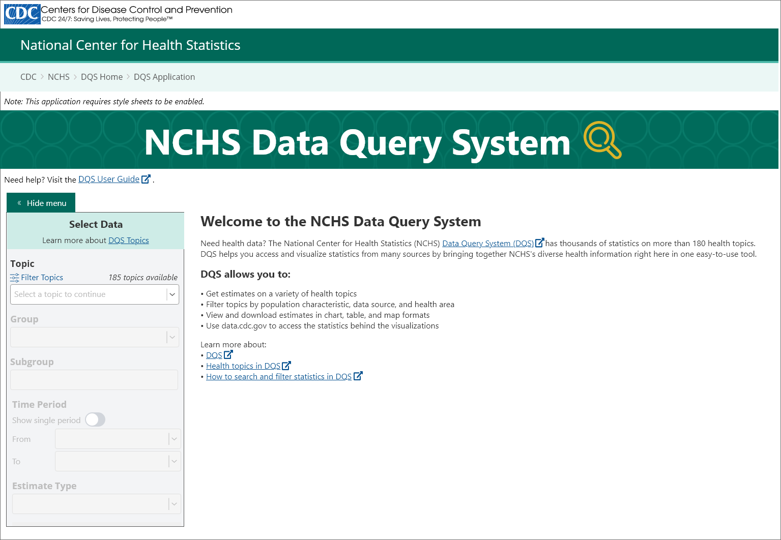
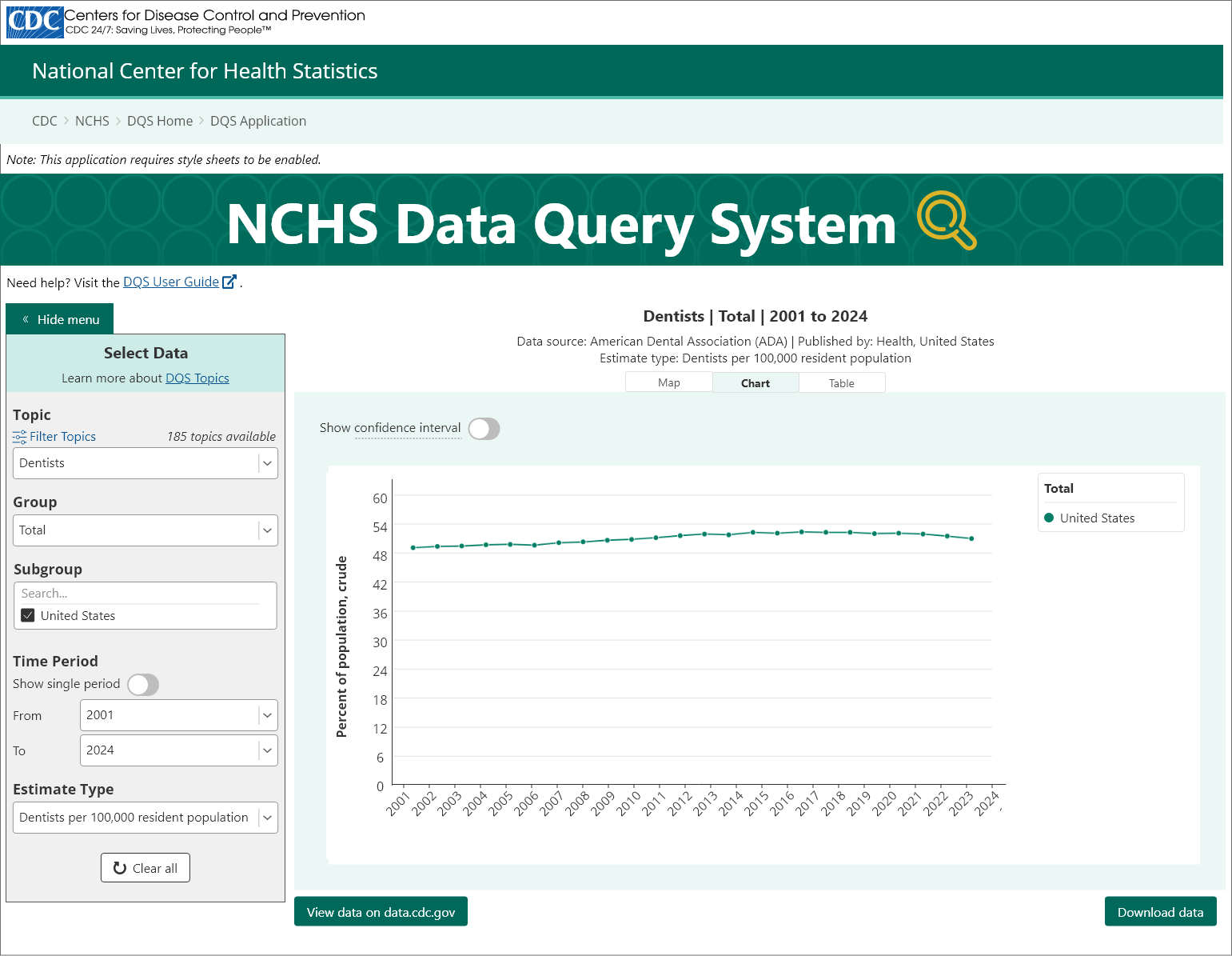
Upon entry, the Topic dropdown will contain placeholder text “Select a topic to continue”. Once a user selects a topic, the remaining query selections are automatically populated with their first available options. This means users can immediately begin exploring the topic they intentionally selected while retaining the ability to refine the remaining selections.
In addition to this solution addressing the increased LOE, developers also confirmed that because this revised interaction populated the remaining selections simultaneously after the topic was selected, it could be implemented directly within the existing application rather than requiring a separate entry page. This eliminated the need to maintain a second page and allowed the new experience to become part of the application’s existing entry state.
The new user flow would function as follows:
Enter application
Select a topic
Remaining selections populate automatically and data visualization becomes available
User can refine the query as needed
This created a balance between two competing needs of 1) preventing a topic from being counted simply because it was automatically selected and 2) avoid forcing users to manually determine every query selection before they can see useful data.
Once the updated mockups and prototypes were complete, I then repeated the previous steps once more: client presentation, approval, developer handoff, implementation, and QA testing. This time, with a successful production delivery.
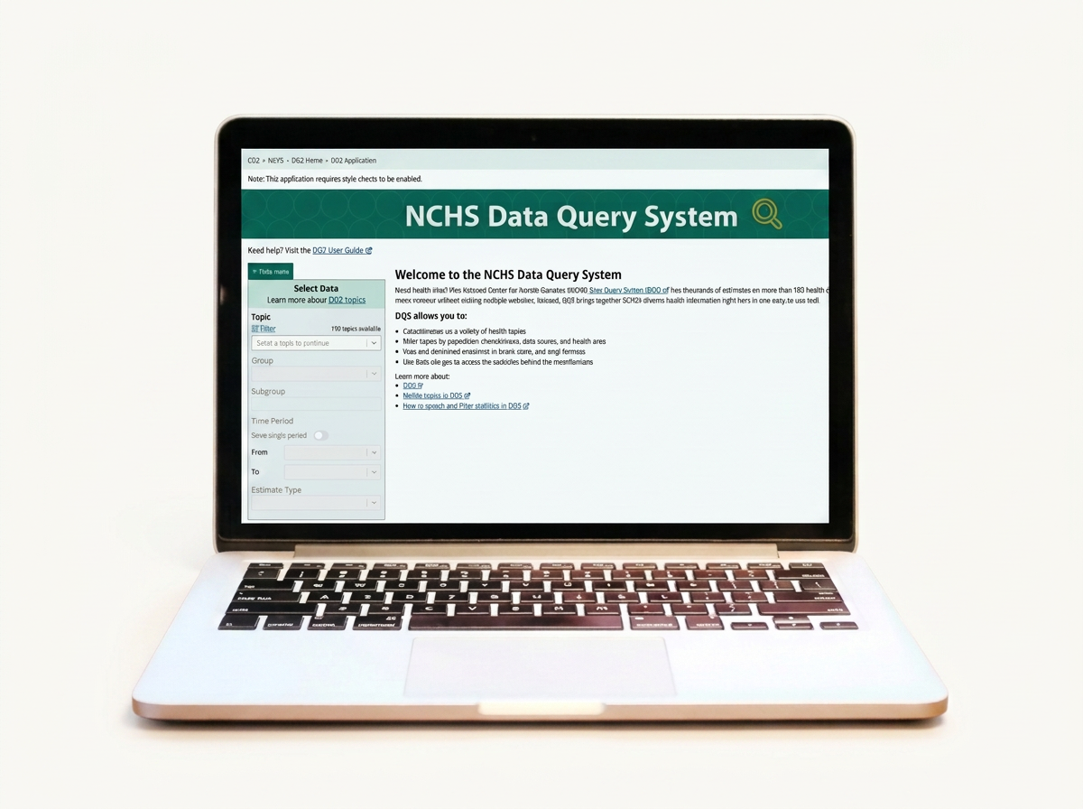
Entry State
Selected State
Outcome
The final solution successfully addressed the original metric problem while creating a lower-effort entry experience. After implementation, the previously elevated metrics associated with the default topic became significantly more stagnant, supporting a clearer relationship between user intent and measured engagement. Users now intentionally select the topic they want to explore rather than inheriting one automatically. At the same time, users are not required to manually configure every additional query parameter before seeing results. The remaining selections are treated as refinements that can be adjusted when needed.
The entry state also created an opportunity to introduce users to DQS before immediately presenting them with a data visualization. Instead of opening directly into a populated visualization, first-time users encounter:
A welcome message
A brief overview of DQS
An explanation of what the application can be used for
Links to relevant resources
The final experience therefore serves both the organization’s measurement needs and the user’s need for a clear starting point.
Reflection / Lessons Learned
This feature reinforced the importance of balancing organizational requirements with user effort. My initial solution addressed the metric problem by requiring users to manually establish every part of their query. While that created a strong signal of intentional interaction, it also introduced more effort than was necessary. Through implementation feedback and further evaluation, I recognized that not every selection needed to be intentional at the same level. The topic selection represented the user’s primary intent while the remaining selections could be populated as defaults and treated as refinements.
This experience also reinforced the value of involving development early. Feasibility discussions during the design process helped shape both the initial and revised solutions, ultimately allowing the final interaction to be incorporated directly into the existing application rather than introducing an additional page to maintain.
I walked away from this experience feeling that I had learned a lot and increased my designer lens, particularly in my ability to balance user needs, organizational goals, and technical constraints.