Team:
UX/UI Designers, Developers, Project Manager, QA, Clients/Stakeholders
My Role:
UX/UI Designer
Expanding Data Exploration Through UX Design
Design and implementation of new data visualization options to expand DQS’ ability to display percent distribution data.
Timeline: September 2025 - December 2025
Tools Used:
Adobe XD, DevOps
Areas Applied:
UX Design | UI Design | UX Research
Project Context
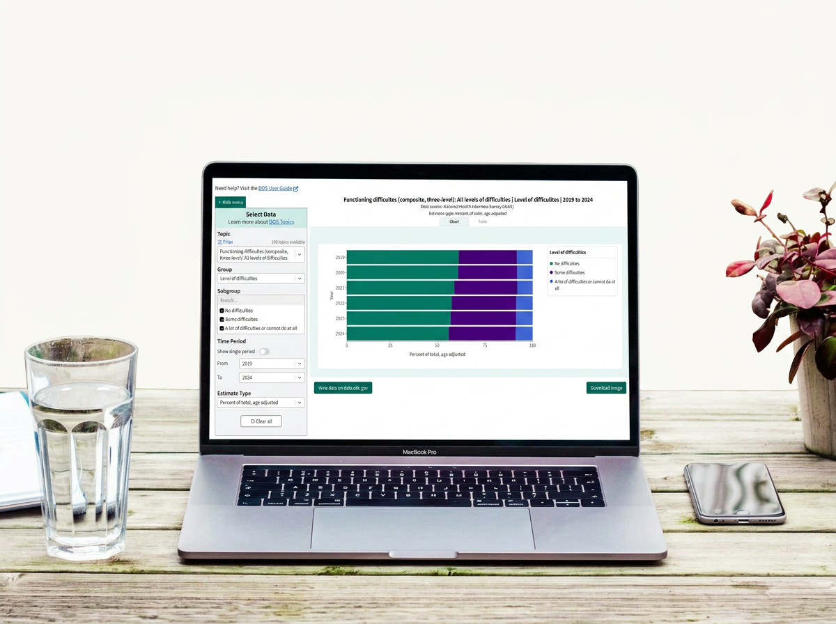
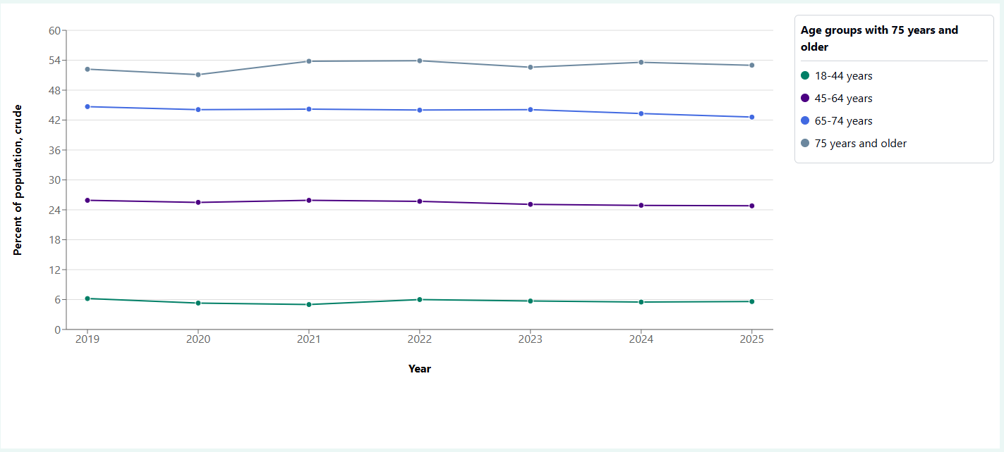
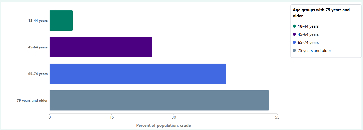
The NCHS Data Query System (DQS) is a CDC health data application that allows users to explore health estimates across different topics, groups, and time periods. Its existing visualization options included line charts, bar charts, maps, and tables.
As additional data became available, the application encountered a limitation: certain estimates representing percent distributions could not be appropriately displayed using the existing visualization types. Because these estimates represented percentages across mutually exclusive categories that totaled 100%, they required a visualization that could communicate the relationship between individual categories and the overall distribution. Without a suitable visualization, these estimates were being excluded from DQS, limiting the range of data available to users.
Problem Area
Design challenge
The solution needed to accommodate distributions for both single and multi-period view, communicate proportional relationships clearly, and smoothly integrate into the application’s existing structure.
Research
Design challenge
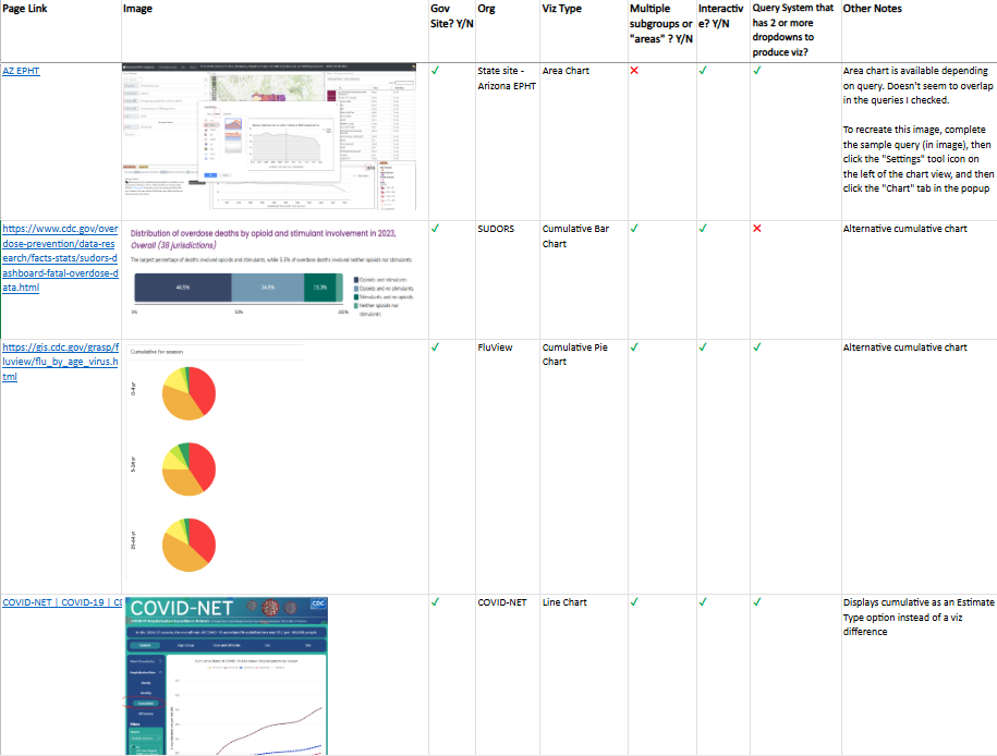
Following the client’s request to explore ways of displaying percent distribution data, I conducted a competitive analysis across four similar health data applications. I mainly evaluated the visualization types used to represent similar data, along with the interactive functionality available within each application. This was an important piece of the evaluation because DQS’ existing visualizations allowed users to interact with the data through hover state tooltips and functional legends so maintaining those features was crucial when evaluating potential solutions.:
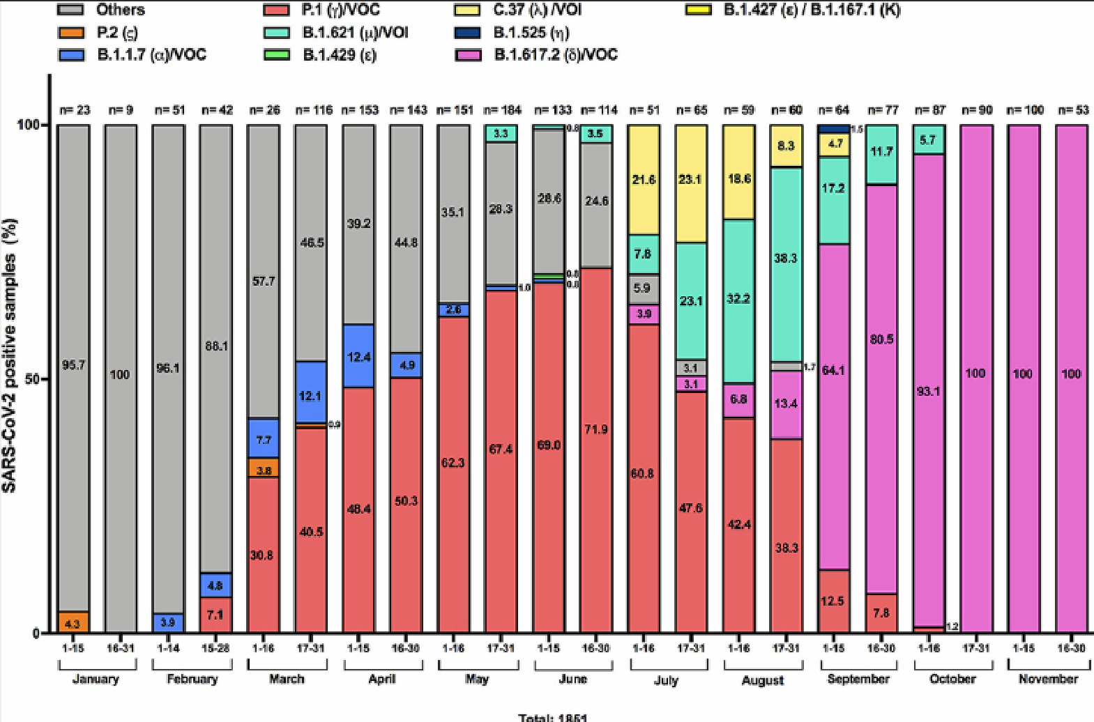
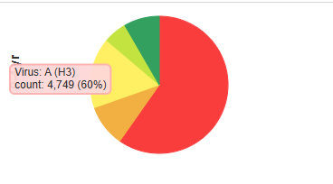
CDC FluView contained a few different visualization types due to have multiple different modules. Examples included vertical stacked bar charts and pie charts
Arizona Environmental Public Health Tracking Explorer contained an area chart within their module
CDC COVID-NET displayed similar data as a line chart but set their estimate type to cumulative instead of a providing a dedicated percent distribution visualization
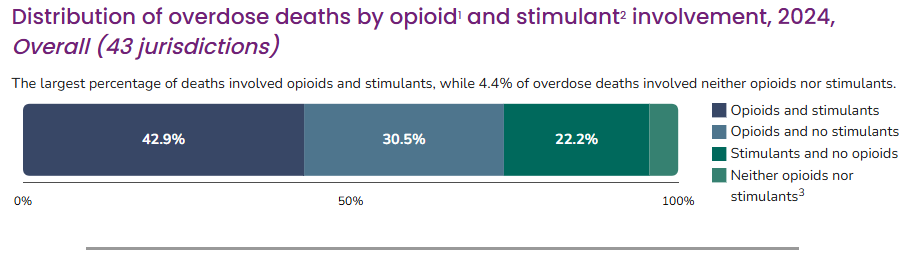
CDC SUDORS contained a horizontally stacked bar chart that provided the percentage data over each category by default
Key Findings
Overall, the research identified three potential visualization types for representing percent distribution data, each offering different advantages depending on the data and intended use.
Area charts: To represent changes in category proportions across multiple time periods, allowing users to observe distribution patterns over time.
Pie charts: To represent how individual categories contribute to a whole area, providing a direct representation of a distribution at a single point in time.
Stacked bar charts: To represent the proportional contribution of categories within a complete distribution, with the flexibility to represent both single periods and multiple periods.
These findings established several possible directions to explore. The next step was determining which options would work best within DQS’s existing visualization framework.
Design & Feedback
Initial Mockups
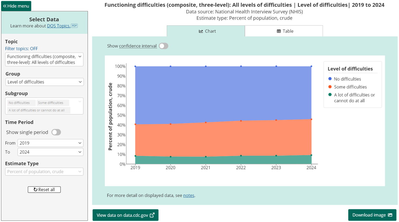
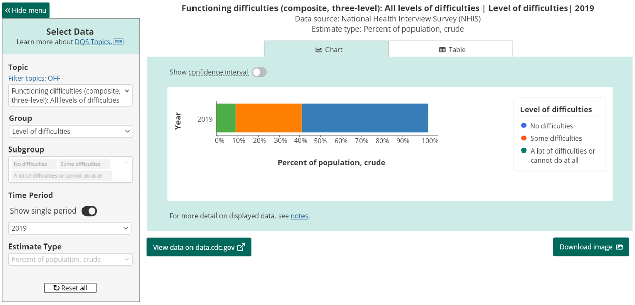
DQS already used line charts to display data across multiple years and bar charts for single-period views. To establish a consistent and familiar relationship between the existing charts and this new proposal, the initial proposal was to introduce both area chart for multi-period, and stacked var chart for single. I then translated the concepts into high-fidelity mockups in Adobe XD to explore how the proposed visualizations would be displayed within DQS.
Area charts for applicable multi-period percent distributions
Feedback
Before presenting the designs to the client, I first met with developers to review technical feasibility. The team confirmed that the proposed designs and interactions could be implemented as presented, allowing the concepts to move forward to client review.
During the client presentation, the proposed area chart raised an important consideration. Although area charts can communicate changes over time, our percent distribution data remained fairly consistent across the years. So, when the solution was applied to the actual data, the filled areas appeared as relatively uniform bands rather than showing the more noticeable fluctuations often associated with area charts. This highlighted a limitation in the initial approach that the visualization could be appropriate in theory but less effective for the specific data being communicated. That said, the client responded positively to the stacked bar chart, prompting us to explore whether it could serve as a more effective solution for both single-period and multi-period views.
Revised Mockups
Stacked bar charts for applicable single-period percent distributions
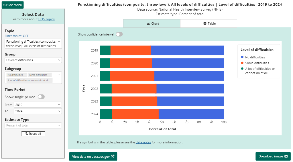
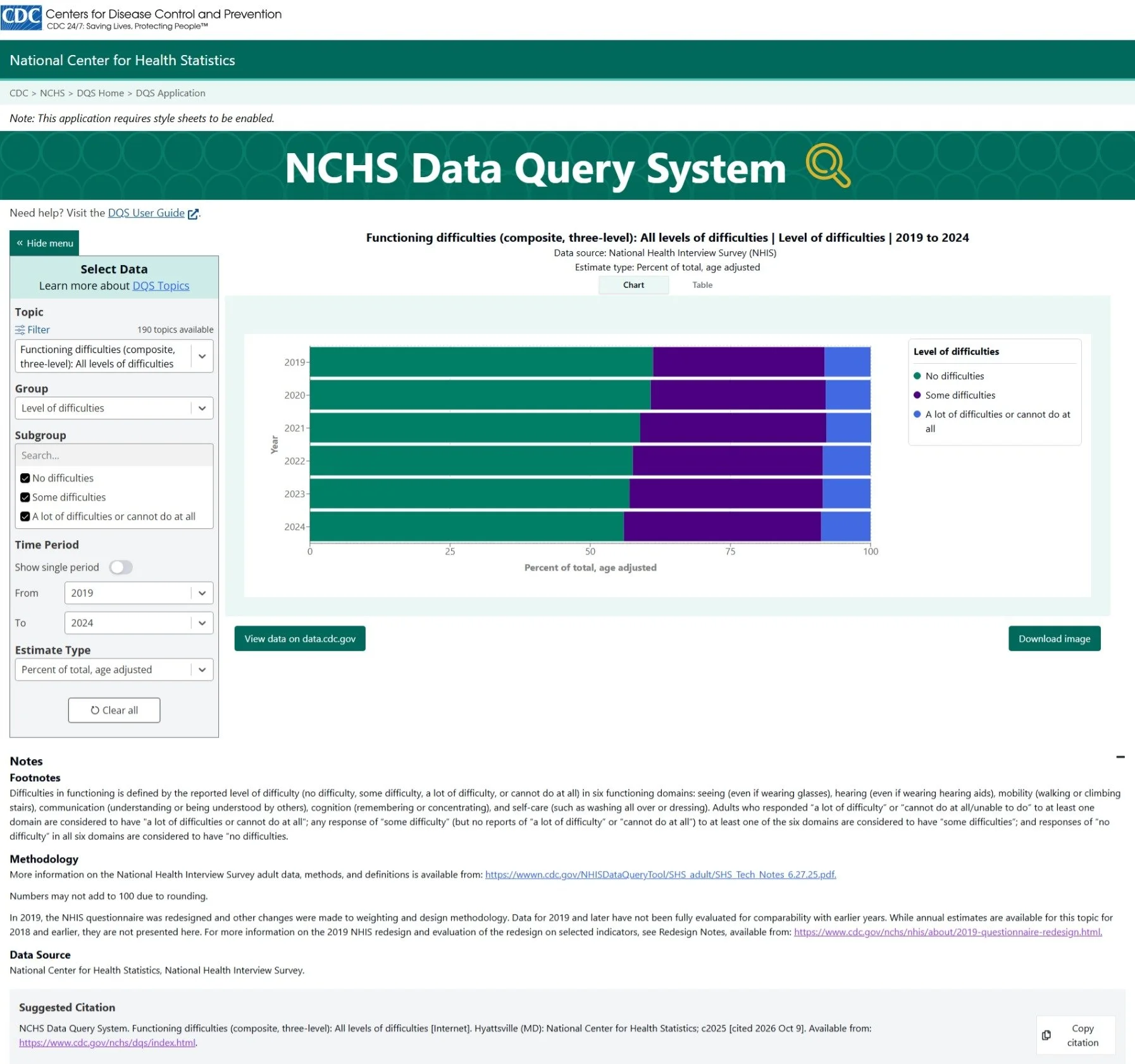
Based on the feedback, I explored extending the stacked bar chart to both time ranges. For single-period distributions, a single stacked bar represented the proportional contribution of each category to the whole. For multi-period distributions, multiple stacked bars allowed users to compare category proportions across years while maintaining the same visual structure.
Multiple stacked bars for applicable multi-period percent distributions
Single stacked bar for applicable single period percent distributions
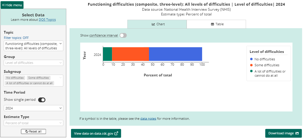
This revised approach established a consistent way to represent percent distributions regardless of the selected time range. I presented the revised designs to the client, and the stacked bar chart approach was approved for both views.
Handoff & Implementation
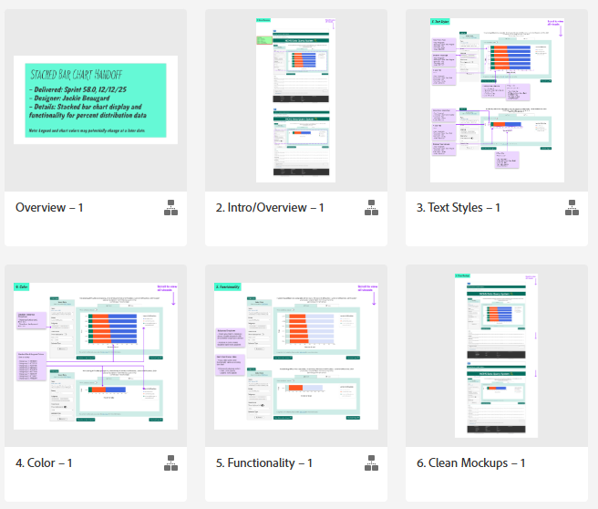
With the final designs approved, I proceeded with preparing developer handoff. As always, this handoff provided all the necessary details, specifications, and interactions needed to implement the new visualization to avoid the need for any confusing or rework.
Once development was complete, the solution was deployed to the internal test environment for review by QA, UX, and the client. Testing confirmed that the new charts functioned as intended, with only minor bugs requiring correction before release. After those fixes were completed, the new visualization was released to production.
One additional action item taken by UX following the production release was making all necessary updates to our design system in Adobe XD. With this being a completely new data visualization, having it incorporated as a component supported the reusability of it in the future.
Outcome
This implementation expanded DQS’ visualization capabilities, allowing additional topics containing percent distribution data to be incorporated into the application. Beyond supporting this previously unavailable data, the new visualization also helped advance DQS’ broader goal of becoming a one-stop destination for CDC data.
By extending the application’s visualization options, the solution supported its continued growth and ability to accommodate additional data. The project demonstrated the importance of evaluating visualizations not only for their ability to represent data, but also for how effectively they communicate that data within the context of an existing product.
View Live DQS Application
Reflection / Lessons Learned
This project reinforced the importance of evaluating design solutions in the context of the actual data they need to communicate. Although the area chart initially seemed like a suitable option, seeing it applied to our data revealed limitations that weren’t as apparent during the research phase. It reminded me that effective data visualization isn’t just about selecting the right chart type on paper. It’s about understanding how the data behaves, how users will interpret it, and how the solution fits within the existing experience. By remaining open to feedback and exploring alternative approaches, I was able to help deliver a solution that expanded DQS’s capabilities while maintaining consistency across the application.